THE CHALLENGE
During the spring of 2015, the new principals at SilverTip Heli-Skiing were re-booting the storied and remote Silver Tip Lodge to provide a superior heli-skiing experience which included updated facilities, new staff and equipment.
Their target market consists largely of worldly, high-value clients, who may be located domestically or overseas.
Our challenge was to create an enticing and cohesive brand in the 3 months before the heli-ski season. Not much time to develop a compelling story and a brand.
THE SOLUTION
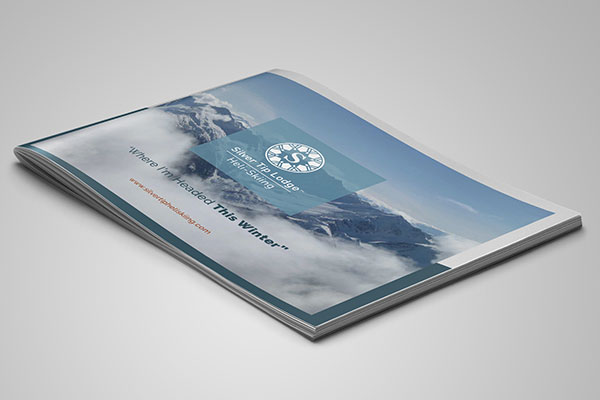
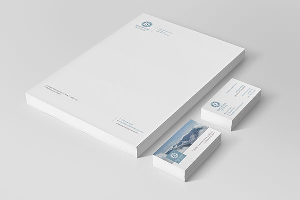
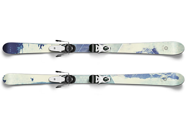
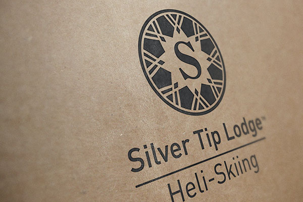
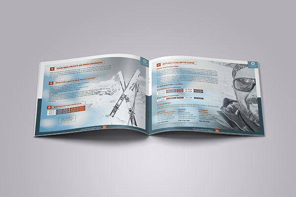
While we did review the fascinating history of the place, we felt that a brand with wide appeal among the demographic would be best. Thus the logo has the feel of a crest. The colours chosen where a rich power blue, white and slate with an accent of burnt umber. The chosen font is a classic sans serif for body copy and a modern san serif for the logo text.
The appeal of this particular range was its exclusivity. If you wanted to ski these famous mountains, the only access was through the SilverTip Heli-ski tenure.
We also created by-lines such as, “Create Memories in the Cariboos… A Lifetime of Them”